001
About project
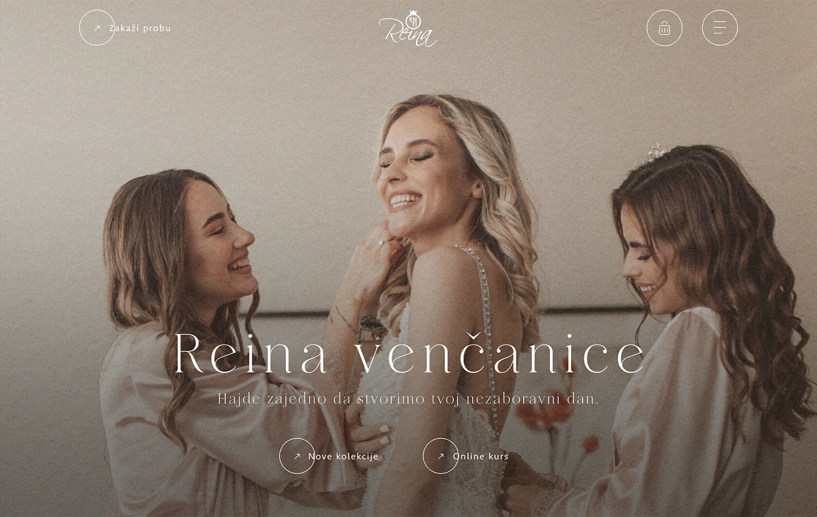
Everything a bride needs before her wedding can be found in this place. So we were given the task of creating a website for Reina En Ti, which will include all aspects of wedding planning, from wedding dresses, bidermeiers, advice and all the way to courses for young people. It was necessary to create an original luxurious and elegant website so that a bride knows she is in the right place from the first meeting with our solutions on the website.

002
Concept
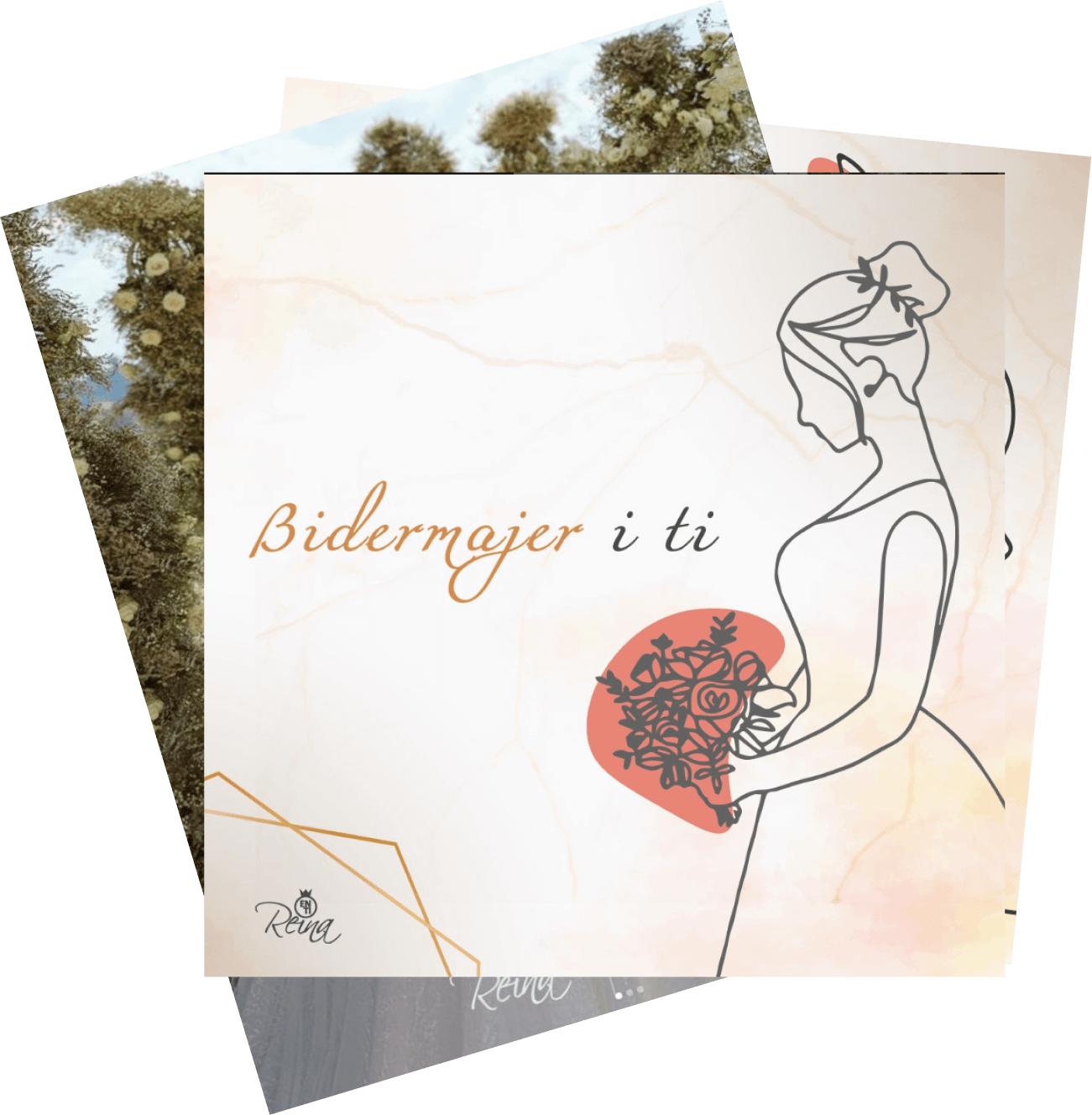
Our goal was to create a website that conveys sophistication, comfort and luxury, without drowning in the sea of modern “premium kitsch”. Carefully selected photos and the sand grain effect create a feeling of warmth and depth. Icons and illustrations, designed with thin lines, add subtlety. The combination of serif and sans-serif fonts contributes to a harmonious and refined visual identity, emphasizing the luxury and sophistication we wanted to convey.
003
Target audience
Girls. Women. Ladies. Brides planning their wedding and looking for a comprehensive, elegant and luxurious online experience. The target audience includes women who appreciate sophistication and details in planning the most important day of their lives, and want the process to be as simple and pleasant as possible.
004
Typography

005
Colors
Soft earthy tones like beige, brown, gray, and subtle orange define the design, creating a clean and modern style. This color palette evokes a sense of calm, making it perfect for young couples who want to feel relaxed and confident while planning their big day.
005
Icons and elements

003
Functionality
The website includes an advanced mega menu, custom post type for collections, e-commerce, card payment integration, and popup functionality. Every feature has been carefully designed to provide a seamless user experience and make wedding planning easier.

Team behind this
project
Project management
Uroš Miljković
Creative direction
Nemanja Radović
Art direction
Nemanja Radović
Design
Igor Popović
Lead developer
Miloš Radovanović
Development
Miloš Radovanović
Nemanja Radović

